Ready to transform a plain wall into a personalized, design-forward statement? You’re in the right place. Whether you’re a first-time decorator or a seasoned home stylist, this in-depth guide unpacks everything you need to know to build a striking poster gallery—from choosing your artwork and frames to mapping, hanging, and lighting the final display. If you’re searching for Wall poster gallery layout ideas that feel curated, balanced, and truly you, consider this your all-in-one blueprint.
Why Gallery Walls Work: The Psychology and Design Magic
Gallery walls are about more than filling space. They express your story, layer color and texture, and create visual rhythm. With smart composition, you can make a small room feel bigger, a lofty room feel cozier, or a hallway feel intentional. The right arrangement draws the eye, balances heavy furniture, and introduces a memorable focal point that sets the tone for your entire home.
- Personality boost: Posters showcase interests—music, travel, typography, vintage ads, photography—without heavy investment.
- Scalable and flexible: Start small, expand later. Rotate easily with seasons or moods.
- Budget-friendly: Affordable art + frames = big design payoff without a big spend.
- Space shaping: Strategic layout can elongate, widen, or anchor your room visually.
Start with Vision: Define Mood, Palette, and Story
Before you hammer a single nail, clarify the look and feel you want. Your goal: cohesion. Even an eclectic gallery benefits from a unifying thread—color palette, subject matter, frame style, or a recurring motif. Ask yourself:
- What mood? Calm and airy (soft tones, ample white space), bold and energetic (high contrast, punchy color), or cozy and nostalgic (warm neutrals, vintage textures)?
- Which palette? Pull 2–4 recurring colors from your posters, rug, or textiles. Repeat them intentionally.
- What story? Travel memories, modern abstracts, music prints, botanicals, or a mix curated by color or theme.
- Which frames? Black for crisp modernity, white for gallery-clean, oak or walnut for warmth, metallics for glam.
Measure, Map, and Mock Up
Great layouts are planned, not guessed. Accurate prep minimizes holes and guarantees balance.
- Measure your wall: Note width, height, ceiling line, furniture dimensions, and outlets/switches.
- Aim for the sightline: Center of the layout should sit about 57–60 inches (145–152 cm) from the floor—museum standard—then adjust for furniture.
- Set boundaries: Tape a visual border to contain your gallery, keeping 4–10 inches (10–25 cm) above sofas or consoles.
- Paper templates: Trace frames onto kraft paper, cut, and tape to the wall. Shuffle until it clicks.
- Digital mockups: Use free tools (Canva, Procreate, Figma, Room Planner) to test scales and spacing.
Pro tip: Photograph your mockup, then squint or convert the photo to grayscale. You’ll spot imbalances instantly.
Curate Your Posters Like a Pro
The most impactful galleries are curated with intention. Mix a few bold anchors with supporting pieces that vary in scale, orientation, and texture.
- Vary scale: Combine 1–2 large anchors (A1/A2/24x36 in) with medium and small prints.
- Mix orientations: Portrait + landscape + square creates rhythm.
- Balance subjects: Pair typographic prints with abstracts, landscapes, or photography for contrast.
- Repeat motifs: Recurring color, line weight, or font style adds cohesion.
- Edit ruthlessly: If a piece weakens the whole, set it aside for another wall.
Frames, Mats, and Finishes
Frames are your layout’s architecture. Mats (mounts) add air and importance; glazing controls glare and UV.
- Frame style: Thin black or white equals modern minimal; oak/walnut adds warmth; brass/black metal reads elevated.
- Consistency vs. mix: Consistent frame color creates harmony; mixing woods/metals looks curated-eclectic when repeated intentionally.
- Mats: White mats enlarge perceived size and add breathing room. Float mounting lends a gallery-grade finish.
- Glazing: Non-glare acrylic reduces reflections; UV-protective glazing preserves color.
- Depth and texture: Consider linen mats, double mats, or shadowbox frames to vary dimension.
Composition 101: Principles That Make Layouts Sing
Every high-impact gallery feels both intentional and alive. These fundamentals get you there.
- Hierarchy: Select a focal piece (largest or boldest). Build the rest around it.
- Alignment: Even in eclectic layouts, align edges or midlines to create invisible structure.
- Spacing: Keep consistent gaps—typically 1.5–3 inches (4–8 cm) between frames. Tighter spacing feels dense and energetic; wider spacing feels calm.
- Odd numbers: Sets of 3, 5, or 7 often feel more dynamic than even numbers.
- Weight balance: Distribute visually heavy pieces diagonally across your grid so one side doesn’t feel lopsided.
- Negative space: Let your layout breathe. Strategic empty wall is part of the design.
Wall poster gallery layout ideas: Quick Overview
Below are proven Wall poster gallery layout ideas that work in real homes—whether your style skews modern, bohemian, classic, or eclectic. Use these as templates, then customize scale, spacing, and frame finishes to fit your room.
- Clean Grid: Symmetrical rows and columns for a polished, museum-grade look.
- Linear Row: A single line (or double row) for narrow hallways and above sofas.
- Salon Mix: Organic, collected-over-time arrangement—big meets small, tight but intentional.
- Anchor + Satellites: One hero piece with smaller prints orbiting around it.
- Picture Ledges: Layered frames on shelves—ultra-flexible and renters-friendly.
- Staircase Sweep: Diagonal climb following your stair angle.
- Corner Wrap: Turn a corner into a 3D gallery by spanning two walls.
- Triptych/Diptych: 2–3 related prints spaced evenly for modern impact.
- Column Stack: Tall vertical stack to emphasize ceiling height.
- Color Block: Arrange by color family for painterly cohesion.
Essential Layout Formulas (With Pro Tips)
1) The Clean Grid
A grid is confidence in rectangle form: rows and columns, equal frames, equal spacing. It suits modern, Scandinavian, or minimal interiors and instantly elevates posters to feel gallery-grade.
- Recipe: 6–12 same-size frames, 1.5–2.5 in (4–6 cm) gaps, laser-level alignment.
- Tip: Keep subject matter and mats consistent for crisp cohesion.
2) Linear Row (or Double Row)
Perfect above a sofa, long console, or hallway. A single row reads calm and architectural. Double up for more presence.
- Recipe: 3–5 medium frames in a row; keep top edges aligned to the furniture line.
- Tip: Mirror frame sizes or alternate portrait/landscape for subtle rhythm.
3) The Salon (Parisian) Mix
Collected, storied, and richly layered. The salon style stacks pieces with varied sizes and frames, anchored by a central focal point.
- Recipe: 1 hero + varied small/medium frames. Start from the center and spiral out.
- Tip: Keep 1.5–2 in (4–5 cm) consistent gaps, even as sizes shift.
4) Anchor + Satellites
Choose one standout print (bold color, large scale), then orbit smaller works around it. Ideal when you have one can’t-miss poster.
- Recipe: 1 large + 4–8 small/medium. Echo the anchor’s colors in satellites.
- Tip: Maintain a loose circle or diamond footprint for cohesion.
5) Picture Ledges
Display frames on shelves and overlap for a layered, editorial look. Swaps are easy—great for renters or frequent refreshers.
- Recipe: Two ledges stacked 10–14 in (25–35 cm) apart; mix heights and overlaps.
- Tip: Heavier frames forward, lighter behind; use museum putty to prevent shifts.
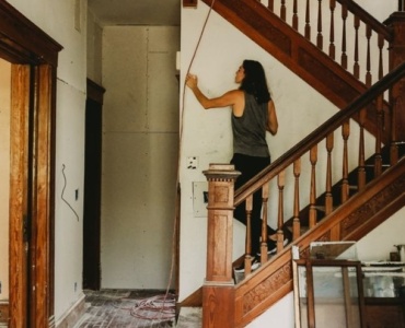
6) Staircase Sweep
Follow the angle of your stairs. The baseline of frames climbs with each step, echoing the architecture.
- Recipe: Align a central diagonal; keep consistent spacing along the slope.
- Tip: Use a long strip of painter’s tape as your “riser” line.
7) Corner Wrap
Turn dead corners into 3D galleries by spanning both walls. The wrap adds depth and surprise.
- Recipe: Mirror heights across the corner; maintain similar spacing both sides.
- Tip: Use the corner seam to align one frame edge for a crisp visual hinge.
8) Triptych/Diptych
Two or three related prints, evenly spaced, deliver a calm, modern statement. Works beautifully above beds and sofas.
- Recipe: Matching sizes/frames; 2–3 in (5–8 cm) gaps; center the entire set to furniture.
- Tip: If art varies, unify with identical frames and mats.
9) Vertical Column Stack
Emphasize height in tight nooks or between windows. A tall stack feels architectural and refined.
- Recipe: 3–5 same-size frames; align centerline; keep tight 1.5–2 in (4–5 cm) spacing.
- Tip: Place the heaviest visual at eye level.
10) Color Block Array
Arrange prints by dominant hue to create bold color fields. Even eclectic subjects read cohesive when grouped chromatically.
- Recipe: Sort posters by color family; cluster each family in contiguous zones.
- Tip: Echo those colors in pillows, throws, or books for room-wide harmony.
Room-by-Room Wall poster gallery layout ideas
If you’re mapping specific spaces, these Wall poster gallery layout ideas will help you tailor proportions, spacing, and mood.
Living Room
For high-traffic showcase spaces, favor layouts with a clear focal point. Among the best Wall poster gallery layout ideas here are the Clean Grid, Salon Mix, and Anchor + Satellites above the sofa.
- Above sofa: Leave 4–8 in (10–20 cm) between the top of the sofa and bottom of frames.
- Scale: Total gallery width should span 2/3 to 3/4 the sofa width for balance.
- Color story: Pull two hues from your rug or cushions to repeat in the art.
Bedroom
Calm, cohesive arrangements win. Consider a diptych/triptych above the headboard or a low, linear row across a dresser as refined Wall poster gallery layout ideas for restful spaces.
- Above bed: Keep the bottom of frames 8–12 in (20–30 cm) above the headboard.
- Soothing palette: Think muted tones, soft abstracts, botanicals.
- Symmetry: Works well in bedrooms to reinforce calm.
Entryway
Your foyer sets first impressions. Consider a compact grid or anchor + satellites as strong Wall poster gallery layout ideas that greet guests with clarity.
- Height: Eye-level centering is critical for quick visual reads.
- Durability: Choose non-glare acrylic to handle light and traffic.
Staircase
Follow the stair angle and keep spacing steady. Staircases love narrative—travel, family, or sequential art are engaging Wall poster gallery layout ideas here.
- Rhythm: Alternate sizes along the slope to avoid monotony.
- Safety: Avoid frames that protrude too far into the walkway.
Home Office
Motivation meets aesthetics. A grid behind your desk reads professional; ledges allow easy seasonal switches—both excellent Wall poster gallery layout ideas for productivity zones.
- Zoom backdrop: Keep visual clutter low if it’s frequently on camera.
- Inspiration: Mix typography (mantras), calendars, and abstracts.
Dining Room
Keep things elevated and cohesive. A linear row or color block array are elegant Wall poster gallery layout ideas to frame a dining experience.
- Glare watch: Use non-glare glazing opposite windows or chandeliers.
- Scale up: Larger frames feel more formal and proportionate.
Kitchen
Smaller prints and playful themes shine. Consider a vertical stack near a pantry or a mini salon mix above a breakfast nook as fresh Wall poster gallery layout ideas.
- Materials: Use sealed frames, easy-wipe glazing.
- Topics: Food illustrations, vintage ads, cheeky typography.
Nursery/Kids’ Room
Safety first, but style right behind it. Lightweight frames, secure mounting, and bright themes make uplifting Wall poster gallery layout ideas for little ones.
- Low hang: Place art at kid-height in play zones.
- Whimsy: Animals, alphabets, bold shapes.
Bathroom
Keep it simple and moisture-aware. A duo or triptych with sealed backs are practical Wall poster gallery layout ideas for humidity-prone spaces.
- Materials: Acrylic glazing; avoid unsealed mats.
- Theme: Spa botanicals, ocean photography, minimalist line art.
Hallway
Tight spaces love linear rows and vertical stacks—clean, directional Wall poster gallery layout ideas that guide movement.
- Scale: Slim frames; keep spacing tight for momentum.
- Lighting: Add picture lights or track lighting for gallery polish.
Color and Theme Cohesion
Even eclectic galleries should carry a thread. Try these strategies to unify your wall:
- Two-colors + neutral: Choose two accent colors and one neutral. Repeat consistently.
- Monochrome with one pop: Mostly black-and-white posters with one color anchor.
- Subject echo: Recur nature motifs, geometric lines, or typographic styles.
- Frame harmony: Consistent frame color or mat width ties diverse art together.
Hanging Hardware, Spacing, and Tools
Seamless install equals pro-level results. A clean, secure hang is as important as the art itself.
- Tools: Tape measure, level/laser level, painter’s tape, pencil, stud finder, hammer/drill, anchors, hooks, Command Strips for renters.
- Hooks vs. strips: Hooks + anchors for heavier frames; high-strength strips for lightweight and flexible layouts.
- Anchors: Use wall anchors in drywall if not hitting studs.
- Wire vs. sawtooth: Wire allows micro-adjustments; two D-rings keep frames from tilting.
- Spacing: 1.5–3 in (4–8 cm) gaps for most layouts; stick to one gap size for cohesion.
Lighting Your Gallery
Light turns posters into presence. Use layers to avoid hotspots and glare.
- Ambient + accent: Combine room lighting with picture lights or adjustable track heads aimed at 30°.
- Glare control: Non-glare glazing; avoid direct reflections from windows.
- Color temperature: 3000–3500K warm-white flatters most art; keep consistent bulbs.
- Dimmers: Adjust mood for evening vs. daytime.
Budget, Sustainability, and Sourcing
Chic doesn’t have to be pricey—and it can be planet-kind.
- Mix sources: Pair affordable prints with one or two splurges.
- Thrift frames: Spray or refinish for a curated look.
- Digital downloads: Print locally to save shipping emissions.
- Reframe seasonally: Store posters in archival sleeves; reuse frames to refresh.
Common Mistakes and Easy Fixes
- Hanging too high: Lower to eye level; let furniture lead the bottom line.
- Inconsistent gaps: Choose one spacing and stick to it.
- No focal point: Pick a hero piece; arrange around it.
- Too small: Size up frames or add mats for better scale.
- Color chaos: Limit palette; repeat core hues deliberately.
Step-by-Step Blueprint: From First Idea to Final Hang
- Collect inspiration: Save 10–15 reference layouts and posters you love.
- Define palette + story: Choose 2–4 recurring colors, 1–2 themes.
- Measure and mark: Tape your intended gallery footprint on the wall.
- Curate art: Select 1–2 anchors; fill in with supportive pieces of varied sizes.
- Frame + mat: Decide frame finish and mat width for cohesion.
- Mock up: Lay everything on the floor first; then use paper templates on the wall.
- Refine spacing: Set a single gap size (usually 2 in / 5 cm).
- Start hanging: Begin with the focal piece at center; build outward.
- Light it: Add picture lights or aim adjustable fixtures at 30°.
- Final tweak: Step back, adjust micro-leveling, check glare, and enjoy.
Style Recipes You Can Copy-Paste
Modern Calm Grid
- Frames: Thin white, identical size
- Art: B/W photography + soft abstracts
- Layout: 2x3 or 3x3 grid, 2 in spacing
Warm Eclectic Salon
- Frames: Mixed oak/walnut + vintage brass
- Art: Travel prints, typography, botanicals
- Layout: Start with a large center anchor; spiral outward
Editorial Ledge Layer
- Frames: Black metal, varied sizes
- Art: Graphic posters, magazines, line art
- Layout: Two ledges 12 in apart; overlap frames
Advanced Touches for a Designer Finish
- Rule of thirds: Place your focal piece near a third-line intersection for natural emphasis.
- Visual triangles: Arrange three related colors/elements to guide the eye.
- Depth play: Shadowbox a few pieces (ticket stubs, fabric swatches) among posters.
- Mirror mix: Insert one small mirror to add light and dimension.
- Edge alignment: Even in salon styles, align bottoms or sides of a few frames to create hidden structure.
Seasonal and Renter-Friendly Switches
Love to refresh? Use frames you can open easily and lean into picture ledges for fast swaps. Keep a flat-file or portfolio of spare posters and rotate by season or mood. For renters, high-strength Command Strips and lightweight acrylic frames allow substantial layouts without wall damage—these strategies pair well with many Wall poster gallery layout ideas across spaces.
FAQ: Your Top Gallery Questions, Answered
How high should I hang my gallery?
Center around 57–60 in (145–152 cm) from the floor. Over furniture, keep 4–10 in (10–25 cm) above the top edge.
What’s the best spacing between frames?
Consistent 1.5–3 in (4–8 cm) gaps. Pick one number and use it everywhere.
Can I mix frames and still look cohesive?
Yes—repeat each finish at least twice and keep mats consistent to tie it together.
How do I avoid glare?
Use non-glare acrylic, angle lights at ~30°, and avoid placing glossy frames opposite bright windows.
Do I need a focal point?
It’s not mandatory in a perfect grid, but every other layout benefits from a clear hero piece.
Putting It All Together
From clean grids to collected salon mixes, the right arrangement amplifies your art and your space. Start with a clear mood and palette, plan with paper or digital mockups, and keep spacing consistent for a pro finish. Curate deliberately: a strong focal point, a repeatable color thread, and frames that complement rather than compete. Then light it right and let your wall do the talking.
If this guide sparked ideas, bookmark it, pin your favorite templates, and begin with one wall this weekend. And if you need a nudge, revisit the room-by-room breakdown—those practical Wall poster gallery layout ideas will carry you from blank wall to wow, every single time.