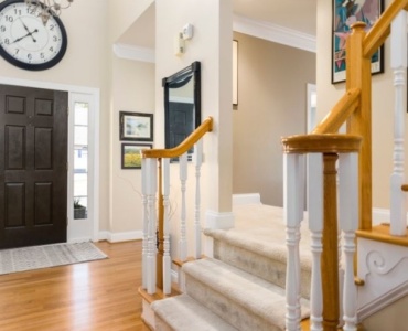
Clutter is not only about excess stuff; it is often the result of unclear choices. When every piece competes for attention, rooms feel noisy and exhausting rather than calm and intentional. The good news: most decorating missteps are fixable. In this in-depth guide, we unpack twelve of the most common interior design mistakes you can avoid and show you exactly how to transform any room into a polished, livable space—without overspending or losing your personal style.
Whether you are furnishing a first apartment or refreshing a forever home, you will find step-by-step advice, pro-level tactics, and small tweaks that deliver outsized impact. From scale and lighting to color, art placement, and layout, these are the practical principles that separate cluttered from cohesive.
Before You Start: The Simple Framework That Prevents Most Problems
Think of your space as a system with five levers: purpose, layout, palette, layers, and editing.
- Purpose: Define what the room must do. Conversation? Work? Dining? Relaxation?
- Layout: Plan circulation and furniture zones before buying anything.
- Palette: Choose a limited, repeatable color story with two to three main hues plus accents.
- Layers: Use texture, lighting, and pattern for depth and warmth.
- Editing: Curate and remove visual noise so focal points can breathe.
Keep those levers in mind as we explore the twelve pitfalls—and the precise fixes that turn a scattered room into a cohesive one.
Mistake 1: Skipping a Vision and Buying Randomly
Impulse purchases are the fastest route to visual clutter. Without a guiding vision, colors clash, styles fight, and your home becomes a collage of almost-right pieces. This is one of the top interior design mistakes you can avoid with a simple mindset shift.
How to Avoid It
- Create a 1-page brief: Write the room’s function, 3 words for the vibe (e.g., warm, modern, grounded), and a budget range.
- Build a mood board: Gather 10–15 images. Identify repeating elements: wood tones, metal finishes, fabric textures, color temperature.
- Set a palette early: Pick 2–3 main colors and 1–2 accents. Repeat them across textiles, art, and decor.
Pro Tip
Shop your board, not the algorithm. If a stunning piece is not on-vision, save it for another room.
Mistake 2: Poor Space Planning and Traffic Flow
Even beautiful furnishings fail when the layout ignores how people move. Dead zones, blocked paths, and furniture islands look messy and feel awkward.
How to Avoid It
- Measure first: Note wall lengths, door swings, windows, and outlets. Draw to scale on graph paper or use a free planner.
- Honor pathways: Leave 30–36 inches for main walkways and 18 inches for light circulation zones.
- Define zones: Anchor each zone with a rug, lighting, and a focal point so areas relate but do not blend into mush.
Quick Layout Wins
- Float the sofa to create conversation groupings.
- Use narrow consoles behind sofas when space is tight.
- Choose round tables in tight dining corners to ease flow.
Mistake 3: Choosing Paint First
Paint is flexible, fabrics and finishes are not. Selecting color before you have key furnishings usually leads to repainting or forced compromises.
How to Avoid It
- Start with fixed elements: Flooring, large furniture, and rugs dictate undertones.
- Test large samples: Paint 24x24-inch swatches on foam boards and move them around the room at different times of day.
- Mind undertones: Pair warm woods with warmer neutrals; balance cool grays with warmer textiles.
Pro Tip
Neutrals still have personalities. Greige with green undertones behaves differently than one with purple. Test side-by-side to see which calms or clashes.
Mistake 4: Ignoring Scale and Proportion
A tiny rug under a giant sectional, a postage-stamp art piece above a grand sofa—mismatched scale makes rooms feel chaotic and cheap.
How to Avoid It
- Use the 2/3 rule: A coffee table should be roughly two-thirds the sofa length; art above furniture should be 60–75% of its width.
- Mind ceiling height: Choose vertical elements (bookcases, drapery) that draw the eye up in low rooms and balance tall spaces with horizontal layers.
- Right-size rugs: Front legs of major seating pieces should sit on the rug; in dining areas, let chairs stay on the rug when pulled out.
Visual Balance Trick
Vary heights across the room: a floor lamp next to a mid-height side table, with low flowers on top. This step-down rhythm relaxes the eye.
Mistake 5: Pushing All Furniture Against the Walls
Hugging the perimeter often exaggerates emptiness in the middle and creates an echo-heavy box. Rooms feel like waiting areas rather than lived-in spaces.
How to Avoid It
- Create conversation clusters: Pull sofas and chairs inward around a rug and table so people can talk at comfort distance.
- Use double-duty anchors: An ottoman with storage or a nesting table set adds function and fills negative space gracefully.
- Float pieces: Even 6–10 inches off the wall introduces depth and shadow, adding visual interest.
Mistake 6: Flat, One-Note Lighting
Ceiling-only lighting washes out color, kills mood, and highlights clutter. Layered lighting is essential for warmth and function.
How to Avoid It
- Use three layers: Ambient (ceiling), task (lamps, sconces), and accent (picture lights, LED strips).
- Install dimmers: Control intensity to match activities and time of day.
- Warm-to-neutral bulbs: 2700–3000K in living spaces, 3000–3500K for task zones like kitchens and offices.
Budget-Friendly Upgrades
- Swap harsh bulbs for high-CRI LEDs.
- Add plug-in sconces for symmetry without hardwiring.
- Use smart plugs to group lamps on a single control.
Mistake 7: Overdecorating and Underediting
Accessories bring personality, but too many small items read as clutter. The eye tires quickly when it has nowhere to rest.
How to Avoid It
- Decorate in threes: Group objects in odd numbers and vary height, shape, and texture.
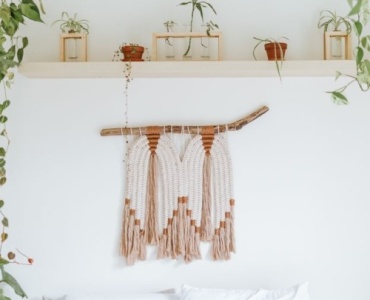
- Give pieces space: Leave negative space on shelves and surfaces to highlight what remains.
- Rotate seasonally: Store extras and refresh displays quarterly so the room breathes.
Editing Checklist
- Remove duplicates or near-duplicates.
- Keep only meaningful or texturally rich items.
- Elevate ordinary objects with trays and risers.
Mistake 8: Neglecting Texture and Material Mix
All-smooth or all-cozy surfaces create monotony. Texture is what turns a flat room into a tactile experience that feels layered and luxurious.
How to Avoid It
- Mix at least five textures: Think linen, velvet, leather, wood grain, stone, metal, wool.
- Balance sheen: Pair matte walls with satin metals and soft textiles; avoid too much gloss.
- Repeat materials: Echo a wood tone or metal finish at least three times for cohesion.
Pro Tip
Choose a hero texture (e.g., bouclé, reclaimed oak) and build supporting textures around it so the room feels intentional, not random.
Mistake 9: Wrong-Sized Rugs
Too-small rugs make rooms feel smaller and choppier. They also disrupt flow between zones.
How to Avoid It
- Living room: Front legs of seating on the rug. Aim for at least 8x10 for medium rooms.
- Dining room: Extend the rug 24 inches beyond the table on all sides so chairs stay on when pulled out.
- Bedroom: For a queen bed, 8x10 is typically right; for a king, 9x12 adds luxury.
Budget Workarounds
- Layer a patterned 6x9 over a large natural-fiber rug for affordable scale.
- Use carpet tiles for custom sizes in awkward rooms.
Mistake 10: Window Treatments That Fight the Room
Short, narrow, or poorly mounted window coverings shrink a room and chop the wall visually.
How to Avoid It
- Hang high and wide: Mount rods 4–12 inches above the frame and extend 6–10 inches beyond each side.
- Length matters: Curtains should kiss or break slightly at the floor unless they are café curtains.
- Layer function: Combine blackout liners with sheers for light control and softness.
Pro Tip
Match drapery rods to other metals in the room and repeat that finish elsewhere for cohesion.
Mistake 11: Awkward Art Placement and Gallery Wall Chaos
Art hung too high or too small gets lost. Overly busy gallery walls can feel like visual noise rather than a story.
How to Avoid It
- Eye-level rule: Center artwork 57–60 inches from the floor, adjusting for household height.
- Scale with furniture: Keep art width at 60–75% of the furniture below it.
- Unify a gallery wall: Use a consistent color palette or frame family and maintain even spacing.
Hanging Smart
- Lay pieces on the floor to mock the arrangement first.
- Use paper templates and painter’s tape to test spacing on the wall.
Mistake 12: Ignoring Lifestyle and Maintenance
A space is only successful if it supports daily life. Delicate fabrics in a kid zone or porous stone in a splash zone invite stress and premature wear.
How to Avoid It
- Choose performance materials: Stain-resistant textiles, wipeable paints, and sealed surfaces.
- Plan storage up front: Closed storage for mess-prone items; open shelves for display-worthy pieces.
- Design routines into the room: Hooks at every door, catchall trays, baskets by the sofa for throws and remotes.
Putting It Together: From Cluttered to Cohesive in 10 Steps
Here is a streamlined process to apply the fixes in real life. Use it like a mini project plan to sidestep the most common interior design mistakes you can avoid while staying on budget.
- 1. Define use and vibe: One function per zone; three vibe words to focus choices.
- 2. Audit what you own: Keep only items that fit your palette, scale, and purpose.
- 3. Map the layout: Draw two options that honor pathways and focal points.
- 4. Choose a palette: Two or three mains, one or two accents; repeat consistently.
- 5. Anchor with a rug: Select size based on seating plan, not the other way around.
- 6. Layer lighting: Ensure ambient, task, and accent are present and dimmable.
- 7. Right-size furniture: Follow proportion rules and leave breathing room.
- 8. Mix textures: Aim for at least five tactile elements in every room.
- 9. Dress the windows: Hang higher and wider; double-layer when possible.
- 10. Edit and style: Curate vignettes, remove extras, and maintain negative space.
Common Questions About Avoiding Design Missteps
What if my budget is small?
Prioritize scale and lighting first. Right-sized rugs, a cohesive palette, and layered lamps offer dramatic returns. Thrift or DIY side tables and art; invest in a supportive sofa and durable rug.
How do I blend styles without clashing?
Pick a dominant style (60–70%), a secondary style (20–30%), and an accent style (10–20%). Keep the color family consistent across all three to bind them visually.
How many colors is too many?
Three mains plus accents is a simple rule. If the room feels busy, reduce contrast: soften bright whites, deepen the primary hue, or mute patterns.
Room-by-Room Notes to Sidestep Pitfalls
Living Room
- Seating geometry: Arrange so people can make eye contact easily; avoid long distances.
- Surface access: Every seat should have a place to set a drink within arm’s reach.
- Media balance: If a TV is the focal point, balance it with art and layered lighting.
Bedroom
- Calming palette: Favor desaturated hues and touchable textures.
- Bed wall: Center the bed, use proper-width nightstands, and flank with lamps.
- Soft landings: Rug or runners on both sides of the bed for comfort.
Dining Room
- Chandelier placement: Center over the table at 30–36 inches above.
- Chair comfort: Prioritize ergonomics and fabric that can handle spills.
- Sound absorption: Add fabric shades, rugs, or upholstered pieces to tame echo.
Home Office
- Task lighting: Use adjustable lights at 3000–3500K; avoid glare on screens.
- Background polish: Style the wall behind your chair with shelves or art for video calls.
- Cable control: Use under-desk trays and grommets to reduce visual noise.
Signs Your Room Is Nearly There
Wondering if you have dodged the typical interior design mistakes you can avoid? Look for these green flags:
- Comfortable flow: Walking paths feel natural and unblocked.
- Consistent palette: Colors repeat from textiles to art to accessories.
- Balanced heights: The eye travels comfortably around the room.
- Layered light: The mood shifts easily from day to night.
- Edited surfaces: Display spots feel curated, not crowded.
Mini Makeover: A 48-Hour Action Plan
If you are short on time but want big results, use this fast plan to sidestep classic interior design mistakes you can avoid and bring cohesion quickly.
- Day 1 Morning: Clear surfaces, remove 30% of accessories, and box them temporarily.
- Day 1 Afternoon: Rearrange furniture to create a conversation cluster. Float at least one piece.
- Day 1 Evening: Layer three light sources. Add dimmers or smart plugs.
- Day 2 Morning: Re-hang art at 57–60 inches centerline; create one focal wall.
- Day 2 Afternoon: Add a larger rug or layer rugs. Style vignettes in threes.
- Day 2 Evening: Replace harsh bulbs with warm LEDs and cue up a playlist. Enjoy.
Materials and Finishes: Cohesion Without Monotony
Choosing finishes is where many people stumble into interior design mistakes you can avoid. The goal is deliberate repetition—not identical matches.
- Wood tones: Keep 2–3 species/tones max; repeat each at least twice.
- Metals: Mix up to two finishes; let one dominate and echo it in hardware or lighting.
- Stone and tile: Coordinate undertones; avoid high-contrast grout unless it is the statement.
- Textiles: Balance pattern scale; pair a large pattern with a small and a solid.
Color Confidence: Palette Pitfalls and Fixes
Color can unify or fragment a space. Avoid these traps and your rooms will harmonize effortlessly.
Pitfalls
- Competing undertones between floors, walls, and upholstery.
- Too much high-contrast pattern in small rooms.
- Relying solely on stark white with cool lighting, which can feel clinical.
Fixes
- Test palettes in daylight and at night.
- Use bridge colors: Throw pillows or art that contain both hues you want to merge.
- Shift intensity: If it feels loud, mute the saturation rather than changing the hue family.
Styling That Sticks: The 80/20 Rule
Let 80% of the room be calm and foundational; reserve 20% for personality and trend. This ensures your design stays cohesive even as you change accents.
- Invest in: Sofa, rug, dining table, major lighting.
- Experiment with: Pillows, throws, art prints, small side tables, lampshades.
Checklist: Avoid These 12 Interior Design Mistakes
- No vision: Create a brief and mood board.
- Bad flow: Plan walkways and zones first.
- Paint first: Choose after key textiles and finishes.
- Wrong scale: Follow 2/3 and 60–75% rules.
- Wall-hugging: Float furniture and cluster seating.
- Flat lighting: Layer ambient, task, and accent.
- Overdecorating: Edit and leave negative space.
- No texture: Mix five or more materials.
- Tiny rugs: Size to the layout, not the budget alone.
- Short drapes: Hang high, wide, and floor-length.
- Art errors: Eye-level and properly scaled.
- Lifestyle mismatch: Durable materials and smart storage.
Final Thoughts
You do not need a degree—or a giant budget—to create rooms that feel calm, considered, and cohesive. By planning your layout, sizing correctly, layering light and texture, and editing with intention, you will bypass the most common interior design mistakes you can avoid and build spaces that look polished and live beautifully. Start with one room, apply the framework, and let every decision serve the vision. The result will be a home that feels unmistakably like you—only clearer, calmer, and more functional.