Designing Mood: How Color Shapes the Feel of Your Interiors
Color has a powerful, quiet voice in every room. It can make ceilings seem higher or lower, increase or reduce appetite, slow the heart rate or spark creativity. Whether you are styling a studio apartment or reimagining a full house, the right palette does more than please the eye; it sets intention. This article explores the role of color in shaping emotion and performance at home, blending science with practice so you can confidently build spaces that feel as good as they look. Along the way, we will connect research on color perception to real decisions about paint, textiles, finishes, and light.
Why Mood Matters: The Silent Language of Color
Every interior sends messages before a single word is spoken. A soft sage living room whispers relax, while a vibrant terracotta kitchen says gather, cook, talk. Color is often the first cue our brains read, priming expectations for comfort, focus, play, or rest. That is why the strategic use of color, often discussed as Color psychology in interior design, belongs at the start of any project brief. When you begin with feeling, your design choices from sofa fabric to bulb temperature align naturally.
Humans respond to color through a trio of pathways: biology, personal experience, and culture. Biologically, certain wavelengths can nudge alertness or calm. Personally, a shade might recall a beloved childhood room or a stressful workplace. Culturally, hues carry messages that vary by region and tradition. Understanding these layers helps you build palettes that support both function and well-being.
The Science and Art Behind Color Perception
The way we see a color at home is never just about the paint. It is the dance among hue, light, surrounding surfaces, and even the time of day. Anchoring your choices in fundamentals makes the rest effortless.
Hue, Value, and Saturation: Your Core Controls
- Hue: The family name of a color, such as red, blue, or green. Hue sets the emotional headline.
- Value: How light or dark a color is. Lighter values expand and air out a room; deeper values add intimacy and drama.
- Saturation: The intensity or purity. Muted colors feel grounded and subtle; saturated ones feel vivid and high energy.
Adjusting value and saturation can completely change how a hue behaves. A pale, grayed blue reads as peaceful mist; a high-chroma cobalt becomes electric and bold. When people say a color is too much, they often mean too saturated for the task or too dark for the light in the space.
Warm vs. Cool: Temperature Sets the Pace
Warm colors, leaning red, orange, and yellow, tend to feel inviting, social, and stimulating. Cool colors, in the blue and green range, often feel calm, spacious, and focused. This temperature dial is a shortcut to mood:
- Warm schemes suit social rooms like living areas and dining zones, where buzz and conversation are welcome.
- Cool schemes excel in bedrooms, bathrooms, and offices where clarity or calm is the goal.
- Balanced palettes use both, letting warm accents animate cool bases or vice versa.
Light Rules: LRV, CRI, and Color Temperature
Even perfect-palette paint fails under bad light. Three concepts will keep you confident:
- LRV (Light Reflectance Value): A number from about 0 to 100 indicating how much light a color reflects. High LRV off-whites bounce light and expand small rooms; low LRV charcoals absorb light for cozy, moody effects.
- CRI (Color Rendering Index): A score out of 100 that tells you how accurately a light source reveals color. Aim for CRI 90+ to keep fabrics, woods, and paints true to life.
- CCT (Correlated Color Temperature): Expressed in Kelvin. 2700–3000K reads warm and intimate, 3500–4000K feels neutral and clear, 5000–6500K mimics daylight and can feel crisp or clinical depending on context.
North-facing rooms lean cool; south-facing rooms bask in warm light. East light is bright and fresh in the morning, while west light turns amber in late afternoon. Test color samples morning, midday, and evening, then with lamps on. This is where the practice of Color psychology in interior design meets physics: no hue exists alone. It always marries the available light.
A Room-by-Room Guide to Setting the Mood
Translating psychological principles into room-specific choices ensures each space supports its purpose. Use the suggestions below as a starting point and then layer your personal references.
Living Room: Connection, Comfort, and Flexibility
Living rooms serve conversations, reading, media, and sometimes work. They benefit from palettes that feel grounded yet adaptive.
- Base: Soft neutrals with warm undertones (greige, taupe, clay) to keep the space welcoming.
- Accents: Ochre, rust, terracotta, or inky blue for depth and sophistication.
- Textures: Bouclé, velvet, and natural woods enrich neutrals so they never feel flat.
To keep energy balanced, weave in green elements (olive textiles, plants) that add biophilic calm. This palette supports hosting without sacrificing relaxation.
Bedroom: Rest, Intimacy, and Recovery
Sleep spaces thrive on low-stimulation cues. Cool and muted hues lower arousal, setting the stage for rest.
- Base: Misty blues, soft sage, lavender-gray, or warm oatmeal to reduce visual noise.
- Accent: Deeper versions of the base hue for headboards or drapery to cocoon the room.
- Lighting: 2700K bedside lamps, dimmable, with warm-toned shades; blackout curtains for circadian alignment.
If you love dark rooms, go bold with midnight blue or forest green at low sheen. Pair with high-LRV linens to keep the look lush, not heavy.
Kitchen and Dining: Appetite, Energy, and Hygiene
Kitchens juggle cleanliness cues and appetite. Whites and light neutrals signal hygiene, while warm notes support sociability and dining pleasure.
- Base: Warm white or pale greige for clarity and bounce.
- Accents: Terracotta, tomato red, saffron, or coral to encourage conviviality.
- Balance: Blue can suppress appetite; if used, keep it muted or secondary, such as a cool backsplash in a warm scheme.
For dining rooms, deeper, saturated colors can be magical at night under dim light: aubergine, tobacco brown, or peacock blue create intimacy and make food glow.
Bathroom: Clarity, Serenity, and Spa Cues
Bathrooms benefit from clean lines and calming hues. Cool neutrals with aqua or mint undertones feel fresh and restorative.
- Base: Pale gray with green undertones, mineral whites, or sand.
- Accents: Sea-glass tiles, matte black fixtures, or brushed brass for warmth.
- Lighting: 90+ CRI, 3000–3500K for accurate grooming colors.
Home Office: Focus, Alertness, and Stamina
Pick colors that sharpen attention without overstimulating. Greens and blue-greens support prolonged concentration, while mid-tone contrast keeps the mind engaged.
- Base: Sage, eucalyptus, or desaturated teal.
- Accents: Warm woods, cognac leather, or mustard to add vitality.
- Lighting: Layered, 3500–4000K during work hours; warmer in the evening to wind down.
Consider a two-tone wall or color zoning to define a video-call backdrop distinct from the workstation. This is a simple, effective application of Color psychology in interior design to nudge context and behavior.
Kids Rooms and Play Zones: Imagination with Boundaries
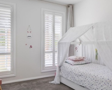
Vivid colors inspire play, but too many bright tones can overwhelm. Use a calm base and let toys carry the rainbow.
- Base: Warm white, soft mint, or dusty peach.
- Accents: Primary colors in controlled doses on storage bins, artwork, or a single mural wall.
- Tip: Choose a palette that can grow up with them by swapping accents rather than repainting the whole room.
Palette Strategies That Work
Great palettes are not accidents. They arise from structure and rules you can lean on, then bend with confidence.
Monochromatic, Analogous, Complementary, and Beyond
- Monochromatic: One hue, many values and saturations. Feels elegant and calming. Example: a suite of moss, olive, and pale pistachio.
- Analogous: Neighbors on the color wheel, like blue, blue-green, and green. Feels cohesive, soft transitions.
- Complementary: Opposites on the wheel, such as blue and orange. High contrast and dynamic. Tame with one dominant, one accent.
- Split-Complementary: A hue plus the two flanking its complement. Energetic but more flexible.
- Triadic: Three evenly spaced hues, often playful and modern. Keep saturation in check to avoid chaos.
To align these strategies with mood goals, start with the function of the room, pick a primary hue that fits the emotional brief, then select supporting hues that stabilize or energize as needed. This is interior color psychology applied with intent.
The 60-30-10 Rule and Its Friends
The classic ratio keeps palettes balanced:
- 60 percent dominant base (walls, large rugs, big upholstery)
- 30 percent secondary (casegoods, drapery, accent chairs)
- 10 percent accent (art, cushions, lamps, flowers)
For moody spaces, try 40-40-20, giving a strong secondary hue equal weight with the base for richer depth. For small rooms that need lift, push the base to 70 percent in high-LRV tones and soften accents to 5 percent.
Neutrals Are Not Boring: Undertones and Range
Neutrals do the heavy lifting. Each carries undertones that can clash or harmonize with wood floors, stone, and fabrics. Test for:
- Green or blue undertones in grays, which read crisp or cool.
- Pink or violet undertones in beiges, which can warm or skew sweet.
- Yellow or red undertones in creams, which can tip sunny or buttery.
Hold large-format swatches near fixed finishes to see harmony or tension. The discipline of Color psychology in interior design includes reading these undertones so your neutrals support the intended mood rather than fighting it.
Texture, Sheen, and Finish: Color Multipliers
Texture changes how we read color. Matte surfaces absorb light and soothe; glossy ones reflect and energize. Rough linen makes color feel organic; lacquer makes the same color feel sleek. Use sheen strategically:
- Ceilings: Flat or matte to hide imperfections and feel soft.
- Walls: Eggshell or matte for velvety, forgiving finishes.
- Trim and doors: Satin or semi-gloss to delineate architecture and increase contrast.
Cultural, Personal, and Biophilic Considerations
Meaning is contextual. Respect cultural signaling and your own stories to make palettes that resonate.
Culture Shapes Color Semantics
White can represent purity or mourning; red can symbolize celebration or caution. If you host diverse communities or design a hospitality space, research local color associations to avoid mixed messages. Even within one city, subcultures assign different meanings. Align your palette with your audience.
Personal History and Preference Mapping
Your experiences shape how you feel in a color. Build a quick preference map:
- Gather references: Save 20 images you love, then annotate what you feel in each.
- Extract hues: Note common colors and whether they are light, dark, warm, cool, muted, or bright.
- Identify triggers: Flag any tones that recall stress (for example, a corporate blue) and avoid them in rest spaces.
Biophilic Design: Nature as North Star
Nature offers endlessly harmonious palettes. Forests combine deep greens, bark browns, and filtered light; coastlines blend sands, stones, and sea blues. Bringing these cues indoors often yields calm clarity. Add texture through jute, wool, wood grain, and plant life to deepen the effect.
Lighting Masterclass for Mood-First Color
Great lighting unlocks the promises your palette makes. Integrate daylight, task, ambient, and accent light for emotional range.
Daylight Orientation and Seasonal Shifts
- North-facing: Cool and consistent; warm up with creamier whites and warm woods.
- South-facing: Abundant warm light; control glare with diffusing fabrics and consider cooler bases to balance.
- East-facing: Bright mornings; sample colors early to catch their most honest read.
- West-facing: Golden evenings; watch that whites do not turn yellow. Sample at sunset too.
Artificial Light: Temperature, Accuracy, and Dimming
Match bulbs to mood and function:
- 2700K: Cozy living and bedroom zones.
- 3000–3500K: Kitchens and bathrooms for clarity without harshness.
- 4000K: Offices or workshops for focus; use with warmer accents to avoid sterility.
- CRI 90+: Keeps your palette true across day and night.
Dimmer switches let one room serve multiple moods. A dining space can glow at 20 percent for intimacy, then brighten to 80 percent for a homework session. When paired with thoughtful palettes, this flexibility is central to effective Color psychology in interior design.
Practical Process: From Inspiration to Implementation
Here is a clear path you can follow from moodboard to finished room.
Write an Emotional Brief
Start with words, not swatches. Define the feeling you want: calm, grounded, bright, sophisticated, playful. List 3 to 5 adjectives. Then note constraints such as low natural light, rental rules, or existing finishes. Your emotional brief will keep every choice aligned.
Build a Palette the Smart Way
- Choose a base hue that supports the brief and suits the light.
- Select 2 to 3 support colors using schemes like analogous or split complement.
- Pick a neutral with friendly undertones to link everything.
- Add a signature accent that carries personality, used sparingly.
Translate digital colors into reality using large-format samples and boards. Bring in fabrics, tiles, and wood tones to see the whole story at once.
Test, Then Test Again
Paint at least 24 by 24 inch swatches on multiple walls. View them across a full day and under lamps. Place art and textiles near the swatches. If a color surprises you, adjust value or saturation first before abandoning the hue family.
Plan for Sheen and Maintenance
- High-traffic areas: Use scrubbable matte or eggshell on walls.
- Bathrooms and kitchens: Consider satin for moisture resistance.
- Doors and trim: Satin or semi-gloss for easy wipe-downs and architectural pop.
Budget-Friendly Mood Shifts
- Textile swaps: Pillows, throws, and curtains can redirect a palette quickly.
- Art rotation: Change prints seasonally to adjust mood without repainting.
- Accent wall or ceiling: A single plane of color can reset the feel of a room.
- Bulb changes: Adjust CCT and CRI to transform how existing colors read.
Common Mistakes and How to Fix Them
Even seasoned designers confront color traps. Here is how to steer clear.
Over-Saturation Everywhere
When everything is bright, nothing is special. Solution: keep saturation mostly in accents or art. Use complex, grayed hues for large surfaces to create sophistication and rest for the eye.
Flat Neutrals That Feel Lifeless
Neutrals without undertone nuance read chalky. Solution: pair warm and cool neutrals, and add texture through woven fabrics, wood grain, and stone. Elevate contrast at trim for depth.
Ignoring Undertones in Fixed Finishes
Stone, tile, carpet, and wood flooring each carry distinct undertones. If you choose wall colors in isolation, clashes arise. Solution: sample with all fixed finishes present. Adjust to complementary undertones.
Not Scaling Color Across Materials
Color lives in furniture, metals, and plants too. If the room feels off, check the sum. Solution: map each hue to multiple materials so the palette feels intentional: a rust throw, terracotta pot, and artwork echo a shared note.
Case Studies: Mood by Design
Small Urban Studio: Expansive Calm
Goal: Make 400 square feet feel airy and organized without visual noise. Approach: High-LRV warm white walls, pale oak floors, and an analogous palette of sage and eucalyptus accents. Lighting: CRI 95 track heads, 3000K ambient, 2700K task lamps at the sofa and bed.
Result: The space reads generous and cohesive. Green tones add focus and a connection to nature, while warm wood prevents sterility. This blend applies the principles of Color psychology in interior design to reduce stress and encourage calm productivity.
Family Home: Energized Gathering
Goal: Support conversation and play on the main floor, with refuge upstairs. Approach: Greige base for continuity, terracotta and ochre accents in the living and dining areas, and deeper blues in the den for movie nights. Lighting: Dimmable layers, warm pendants over the table, and 3500K task lights in the kitchen.
Result: The social zones feel lively and cohesive; private zones upstairs are cocooned in muted blues and greens for rest. The palette flexes across activities while speaking one consistent emotional language.
Minimalist Retreat: Depth Without Clutter
Goal: Deliver serenity and sophistication with minimal objects. Approach: Monochromatic neutral scheme in layers of stone, bone, and mushroom. Texture stands in for ornament: limewash walls, boucle sofa, and ceramic accents. Lighting: Wall washers and concealed strip lights emphasize silhouettes.
Result: Peaceful, tactile rooms that never feel empty. Careful control of value and texture shows how minimal palettes can be emotionally rich when guided by interior color psychology.
Checklist and Quick Wins
Use this rapid checklist as you finalize a palette:
- Define mood: Choose 3 to 5 words that guide every choice.
- Check light: Note orientation, measure lux if possible, and select bulbs with CRI 90+.
- Map undertones: Compare large swatches to floors, tiles, and major fabrics.
- Plan ratios: Decide on 60-30-10 or a variation suited to your room.
- Layer texture and sheen: Use matte for calm, gloss for energy.
- Test big: Paint 24 by 24 inch samples on multiple walls and view day and night.
- Align accents: Echo your accent hue in at least three places for cohesion.
Weekend-Ready Updates
- Swap to warm 2700K bulbs in bedrooms for instant softness.
- Paint only the ceiling a pale tint to lift a low room.
- Add a patterned rug that introduces your accent color with texture.
- Reframe and regroup art to reinforce palette rhythm.
FAQs: Your Color and Mood Questions Answered
Do darker colors make rooms feel smaller? Not always. Dark hues can blur edges and create a cocooning effect that feels luxurious. Pair with good lighting and high-contrast trim to avoid a cave-like feel.
How many colors should I use in one room? Aim for one base, two supports, and one accent. Variations in value and texture increase richness without adding chaos.
What if my partner and I prefer opposite palettes? Start with shared neutrals, then assign personal accents to defined zones. Compromise on saturation levels rather than hue family when possible.
Can I use bold colors in small spaces? Yes. A jewel-box powder room with deep color can be unforgettable. Keep fixtures simple and lighting flattering.
Why do my samples look different at home than in the store? Showroom lighting and surrounding colors alter perception. Always test at home on multiple walls and over several days.
Bringing It All Together
The best interiors align what a room does with how it should feel. By starting with mood, understanding hue, value, and saturation, and mastering light, you build spaces that support sleep, focus, sociability, or repose on cue. Remember that Color psychology in interior design is not a rulebook but a toolkit. Use it to translate your values and routines into color decisions that make everyday life smoother and more joyful.
When you next hold a fan deck, begin with feeling. Let the palette follow. With careful testing, attention to light, and mindful layering of texture and sheen, color becomes your most powerful design ally.
Action step: Write a three-word emotional brief for your next room, choose a base hue and two supports that honor those words, then test large swatches in your actual light. You will be amazed how quickly the right palette reveals itself.
In the end, great design is not just about what you see. It is about what you feel the moment you step through the door.