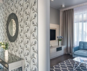
Blue is one of the most versatile hues in interior design. It can calm or energize, read crisp or cozy, and play equally well with metals, woods, and neutrals. When your living room revolves around blues—navy sofas, sky‑blue walls, teal accents—the window treatments do more than control light; they shape how the entire palette reads. If you’ve ever wondered how to choose curtains for a blue‑tone living room without second‑guessing, this in‑depth guide delivers a step‑by‑step framework, pro color strategies, fabric know‑how, and style‑specific solutions you can put to work today.
Understand Your Blue: Undertones, Intensity, and Mood
Every blue carries an undertone that shifts a room’s atmosphere. The right curtains can reinforce or rebalance that mood.
- Cool undertones (purple or gray in navy, indigo, slate blue): feel refined and serene. Curtains can soften with texture (linen, slub cotton) or amplify polish (velvet, silk blends).
- Warm undertones (hint of green in teal, peacock, marine blue): feel lively and inviting. Curtains in natural linens, sandy neutrals, or warm metallics keep the look fresh rather than overly saturated.
- Intensity: Saturated walls or a bold navy sofa call for either tonal subtlety or measured contrast. Pale powder‑blue rooms welcome deeper drapes for grounding and definition.
- Finish: Matte paints and bouclé upholstery like a little sheen in drapery. Glossy lacquers pair well with textural, nubby curtain fabrics to prevent visual glare.
Light Orientation Changes Everything
Blue behaves differently depending on natural light:
- North‑facing rooms skew cooler. Choose warmer neutrals (oatmeal, stone, warm white) or soft patterns to counterbalance chill.
- South‑facing rooms glow. Sheers and lighter tones prevent over‑saturation; consider UV‑protective linings to protect fabrics and floors.
- East‑facing rooms bathe in morning light; opt for light‑filtering layers that preserve brightness.
- West‑facing rooms glow warm in the evening; pick fabrics that tame glare (linen blends, pinch‑pleat styles with interlining).
The Decision Framework: How to Choose Curtains for a Blue‑Tone Living Room
Before falling in love with a swatch, use this sequence to set your choices up for success.
- Confirm your palette: Identify the dominant blue (navy, sky, teal, steel), supporting neutrals (white, cream, gray, taupe), and accent colors (brass, coral, rust, terracotta, gold).
- Define function: Privacy, glare control, acoustics, insulation, and blackout needs drive fabric weight, lining, and layering.
- Pick a color strategy: Tonal harmony, complementary contrast, neutral balance, or analogous pairing—explained below.
- Select fabric and header: Linen vs velvet vs cotton; pinch pleat, ripple fold, grommet/eyelet—these define drape and style.
- Plan hardware: Rod placement, finish (brass, matte black, chrome), rings, and finials influence the overall sophistication.
- Measure and specify: Length (“kiss,” “break,” or “puddle”), width/fullness (2x–2.5x), return and overlap for blackout effectiveness.
- Layer intelligently: Pair sheers with lined drapery, or roman shades with decorative panels for maximum versatility.
Work this framework and you’ll know exactly how to choose curtains for a blue‑tone living room that align with your style and daily life.
Color Strategies That Always Work with Blues
Your curtain color is the hinge connecting wall color, upholstery, and accents. Choose one of these proven strategies.
Tonal on Tonal: Refined and Cohesive
Choose a curtain a shade lighter or darker than your main blue. For a navy sofa and pale gray‑blue walls, try a mid‑blue linen. The result is depth without drama—especially good for modern minimal or Scandinavian spaces.
- Navy room + steel‑blue drapes: sophisticated, hotel‑like polish.
- Powder‑blue walls + indigo velvet: crisp contrast that still reads tonal.
- Teal accents + peacock‑tinted linen: relaxed and layered, excellent for boho or eclectic rooms.
Complementary Contrast: Energize with Warm Notes
Blue’s opposite on the color wheel lives in the orange family (rust, terracotta, coral, peach). A whisper of warmth in your curtains can electrify a cool palette—no neon necessary.
- Navy + rust woven fabric in a fine herringbone adds texture and subtle heat.
- Steel‑blue walls with taupe‑to‑caramel ombré stripes bridge cool and warm beautifully.
- Coastal blues paired with sand or flax linens feel breezy and grounded.
Neutral Balance: Calm, Luxurious, Flexible
Ivory, warm white, oatmeal, mushroom, dove gray, and greige are foolproof curtain colors for blue lounges. They soften contrast, photograph elegantly, and pivot easily if accents change.
- Warm white linen with navy walls = gallery‑clean yet inviting.
- Oatmeal pinch‑pleats with teal accessories = tailored and textural.
- Greige velvet with indigo upholstery = luxe and light‑taming.
Analogous Harmony: Layered, Designer‑Grade
Stick to neighboring hues—turquoise, teal, indigo, blue‑green. This creates nuance without sharp contrast. Great for rooms with complex art or patterned rugs.
- Indigo rug, teal pillows, and blue‑green curtains feel collected and intentional.
- Sky‑blue walls with sea‑glass sheers deliver ultra‑soft transitions between elements.
Fabric Matters: Texture, Weight, and Drape
Fabric dictates how light moves, how color reads, and how formal the space feels.
Linen and Linen Blends: Airy, Artful, Forgiving
Linen’s slub texture diffuses light and makes blues look painterly. Ideal when you’re exploring how to choose curtains for a blue‑tone living room that won’t feel stiff.
- Pros: Breathable, casual‑to‑tailored, great texture, easy to layer.
- Cons: Wrinkles (choose lined or blended weaves to tame it), less blackout unless interlined.
Velvet: Dramatic, Light‑Blocking, Luxe
Velvet deepens color and absorbs sound. Navy or indigo velvet drapes bring cinema‑room vibe, while taupe velvet against teal balances glow.
- Pros: Superb drape, blackout potential, acoustic comfort, winter‑friendly.
- Cons: Heavier hardware required, may overwhelm tiny rooms if too dark.
Cotton, Twill, and Performance Polyester: Versatile Workhorses
For families and rentals, these fabrics deliver durability and consistent color. Ideal for blue living room curtains that must endure sun and daily handling.
- Pros: Easy care, budget‑friendly, prints take well.
- Cons: Can look flat unless you add lining or texture; avoid overly shiny synthetics.
Sheers and Layering: Light Without Sacrificing Privacy
Combine sheer curtains with lined panels or roman shades. In a coastal or Scandinavian living room, this pairing maximizes softness and daylight.
- Use case: Street‑level privacy by day, blackout at night via lined panels or roller shades.
- Tip: Choose off‑white sheers to warm cool blue schemes, or whisper‑blue sheers to enhance airiness.
Prints and Patterns: Scale, Rhythm, and Restraint
Patterns can anchor or overwhelm. Follow scale and contrast rules to keep your blue palette in charge.
When to Go Bold
If walls and sofa are solids, curtains may carry pattern. Consider stripes, tailored geometrics, or soft botanicals with blue accents.
- Stripes: Nautical or ticking stripes suit coastal style; pair with rope‑textured rods or brushed nickel.
- Geometrics: Lattice, Greek key, or small herringbones echo architectural order in modern rooms.
- Florals: Choose cooler florals with indigo vines or balanced warm blooms to bridge blues and brass.
Pattern Mixing Made Simple
- Vary scale: Large‑scale curtains + mid‑scale rug + small‑scale pillows.
- Limit your palette: Three key colors repeated across patterns maintain cohesion.
- Let blue lead: Keep blue present in each pattern to unify.
Light, Privacy, and Performance: The Technical Side
Form follows function. Decide how much light you want, when, and where.
- Light‑filtering: Ideal for daytime softness; pair with blackout roller shades if you watch TV or nap in the space.
- Blackout: Look for 3‑pass lining, magnetic returns, and proper overlap at center to block light leaks.
- Thermal/energy‑saving: Interlining or thermal weaves help insulate, especially useful behind velvet in drafty homes.
- UV protection: Essential for south‑facing rooms with dark blue upholstery—prevents fading.
- Acoustics: Heavier fabrics like velvet and wool blends help hush echo in open‑plan living rooms.
Measuring, Sizing, and Installation for a Polished Look
Great curtains can look mediocre if they’re undersized or hung low. Here’s the pro approach.
Hang High, Go Wide
- Rod height: Mount 4–8 inches above the window frame (or just below crown molding) to elongate walls.
- Rod width: Extend 6–12 inches beyond the window on each side so panels clear glass when open—this preserves daylight and makes windows look larger.
Length Options
- Kiss: Hem barely touches the floor—crisp and contemporary.
- Break: 1–2 inches extra length adds softness without fuss.
- Puddle: 4–8 inches extra for romance and drama; better for formal rooms and low‑traffic zones.
Width and Fullness
Aim for 2x to 2.5x the window width in fabric to avoid looking skimpy. For grommet or ripple fold, manufacturer guides dictate fullness; for pinch pleat, 2.25x is a dependable target.
Hardware and Finishes
Match or contrast with intention:
- Brass warms navy and cobalt; echoes frames and lamps.
- Matte black sharpens sky‑blue and modern silhouettes.
- Brushed nickel/chrome complements slate and steel‑blue palettes.
Choose sturdy rods for velvet or interlined panels. Rings with hooks enhance pleats, while concealed tracks are sleek for ripple fold.
Style Scenarios: Curated Curtain Ideas for Blue Rooms
If you’re still distilling how to choose curtains for a blue‑tone living room, these tailored recipes remove guesswork.
Coastal and Breezy
- Palette: Sky blue, sea‑glass, white, raw wood.
- Curtains: Off‑white or pale‑blue linen sheers with lined linen panels.
- Hardware: Brushed nickel or white wood rods.
- Details: Ticking‑stripe pillows echo curtain stripe trims for subtle nautical notes.
Modern Minimal
- Palette: Navy, charcoal, optical white, matte black.
- Curtains: Steel‑gray ripple‑fold panels or crisp white cotton twill with blackout lining.
- Hardware: Black metal track; concealed if possible.
- Details: Avoid fussy tiebacks; integrate motorized roller shades for clean lines.
Classic Traditional
- Palette: Indigo, cream, walnut, antique brass.
- Curtains: Cream or greige velvet in double pinch pleat, interlined for body.
- Hardware: Antiqued brass with ball finials and rings.
- Details: A subtle Greek key banding along the leading edge ties to navy upholstery.
Boho Eclectic
- Palette: Teal, peacock, terracotta, mustard, natural fibers.
- Curtains: Oatmeal linen with mudcloth‑inspired print; or teal‑tinted sheers layered over privacy shades.
- Hardware: Aged bronze or black rods with artisanal finials.
- Details: Mix pillow patterns (ikat, suzani) echoing curtain hues at varied scales.
Scandinavian Calm
- Palette: Powder blue, white, pale oak, soft gray.
- Curtains: White or pearl‑gray linen, light‑filtering lining to keep it bright.
- Hardware: Minimal white or birch rods.
- Details: Layer sheers for winter light; add wool throws to support texture.
Room Constraints and Smart Solutions
Small Space or Low Ceilings
- Go vertical: Hang rods near the ceiling; choose floor‑to‑ceiling panels.
- Keep tones light: Pale neutrals or soft blues expand visually.
- Skip heavy puddles: “Kiss” length prevents visual clutter.
Renter‑Friendly and Apartments
- Tension rods or 3M brackets avoid drilling.
- Layer shades + decorative panels to enjoy style without major installs.
- Neutral curtains adapt when you move—budget win.
Kids, Pets, and High‑Traffic Living
- Performance fabrics resist stains and sun.
- Shorter breaks or “kiss” lengths minimize pawing and dust.
- Machine‑washable cottons for easy upkeep; consider cordless roman shades for safety.
Budget vs. Custom
- Ready‑made: Great for standard windows; add tailor touches with banding or rings.
- Semi‑custom: Choose length, lining, and header—sweet spot for value and fit.
- Full custom: Best for bay windows, extra‑wide spans, specialty fabrics, or perfect pattern matching.
Hardware Deep Dive: Small Parts, Big Impact
Even perfect fabric underwhelms on the wrong rod.
- Finials: Sphere or cap for modern; crystal or leaf for traditional; keep scale proportional to window.
- Rings and hooks: Enable smooth stacking and fuller pleats; choose metal finishes that echo lighting or frames.
- Returns: Wrap panels back to the wall to block edge light—key in media rooms.
Common Mistakes to Avoid
- Hanging too low: Shrinks the room visually; raise rods to elongate walls.
- Skimpy width: Curtains should look generous when closed and sculptural when open.
- Ignoring undertones: A cool gray curtain can clash with a green‑leaning teal.
- One‑note blue overload: Introduce neutrals or warm metals to prevent a flat, icy outcome.
- No lining: Unlined panels fade quicker and hang limply; even light linings dramatically improve drape.
Care, Maintenance, and Sustainability
Great curtains are an investment. Treat them accordingly—and consider the planet.
- Regular care: Vacuum with a soft brush monthly; spot clean promptly.
- Sun strategy: Rotate panels seasonally to even out fading; use UV lining in bright rooms with navy or indigo upholstery.
- Eco‑friendly options: Organic cotton, Oeko‑Tex linens, recycled polyester sheers, FSC‑certified wood hardware.
- Longevity: Interlining adds body and reduces wear; quality rings prevent snagging.
Quick Answers: FAQs for Blue‑Led Spaces
How to choose curtains for a blue‑tone living room with north‑facing windows?
Favor warm whites, oatmeal, or greige in textured linens to offset cool light. Add interlining for body and warmth, and brass or antique‑gold hardware to introduce a subtle glow.
How to choose curtains for a blue‑tone living room when you already have a navy sofa?
Balance the depth with lighter curtains—ivory linen, dove gray twill, or a pinstripe that carries a thin navy line. If the walls are light, mid‑blue or greige velvet creates a luxe anchor without darkening the room too much.
How to choose curtains for a blue‑tone living room if you love patterns?
Pick a curtain print that repeats your room’s blue and one neutral. Keep pattern scales varied and ensure the curtain’s background color harmonizes with your wall or trim color.
How to choose curtains for a blue‑tone living room on a budget?
Use ready‑made panels in a neutral or soft blue, then elevate with iron‑on banding, upgraded rings, and proper rod placement. Layer with affordable roller shades for privacy and blackout.
A Designer’s Checklist
- Palette mapped: Dominant blue, undertone, and accents identified.
- Function clear: Privacy, blackout, acoustics, UV protection needs defined.
- Color strategy chosen: Tonal, complementary, neutral, or analogous.
- Fabric and header set: Linen/velvet/cotton; pinch pleat/ripple/grommet.
- Hardware aligned: Finish synced to metals; rod height and width optimized.
- Measurements confirmed: Length style, fullness 2x–2.5x, returns and overlap planned.
- Layering planned: Sheers + lined panels or shades + decorative drapes.
- Care strategy: Lining, maintenance, and UV mitigation in place.
Putting It All Together
When you distill your palette, define function, and select fabric and hardware with intention, curtains become the finishing move that makes your blue room sing. Whether you crave tonal calm or a warm counterpoint, the combinations here give you confidence in how to choose curtains for a blue‑tone living room that feels curated and personal. Start with undertones and light, commit to a color strategy, then specify fabric, lining, and installation like a pro. Your blue‑toned living room will reward the effort every time the light changes, the TV turns on, or guests step inside and say, “Wow.”