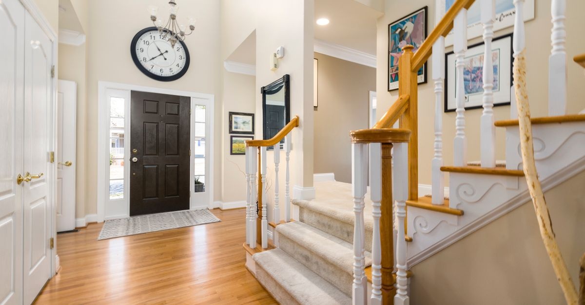
Your staircase isn’t just a passage from one floor to the next—it’s a narrative spine for your home. Its vertical rhythm, dramatic sightlines, and daily foot traffic make it the perfect stage for a photo display that tells your story. In this comprehensive guide, you’ll learn how to arrange a photo gallery on stairs so it feels intentional, balanced, and beautifully integrated with the architecture. From layout geometry to frame selection, lighting, and installation, we’ll walk step-by-step through everything you need to create a stairway gallery that rises with you.
Why Staircase Galleries Work
A stairwell is inherently cinematic: you enter at ground level and rise through frames, each moment unfolding in sequence. When curated with care, a staircase gallery wall becomes:
- A living timeline where family milestones and travel memories ascend in rhythm with the steps.
- A visual guide that draws the eye upward, emphasizing ceiling height and architectural details.
- A design anchor connecting lower and upper floors with a cohesive creative theme.
- An everyday gallery you experience at different paces—quick glances on busy mornings, slow appreciation on quiet evenings.
Unlike a flat hallway wall, a staircase introduces slope, changing vantage points, and varying eye levels. That complexity becomes a strength once you understand the simple rules that keep a sloped gallery feeling effortless.
Plan First: Vision, Story, and Style
Define the Story You Want to Tell
Before frames and nails, decide what narrative your stairway will carry. A clear story keeps selections cohesive and helps you choose the right arrangement method.
- Family Chronicle: Births, birthdays, graduations, and candid moments that chart your shared journey.
- Travel Atlas: A sequence of landscapes, street photography, and tickets/maps for texture.
- Artful Mix: Drawings, prints, textiles, and photos curated by mood or color rather than date.
- Minimal Monograph: Large-scale, unified black-and-white photographs for a gallery-grade presence.
Choose 1–3 curatorial principles to guide you—for example: “black frames, white mats, and crisp architecture shots” or “warm wood frames with soft, candid family photos.” These simple rules streamline every decision to come.
Select a Visual Language
Consistency helps a sloped arrangement feel serene rather than chaotic. Consider unifying by:
- Color Palette: Monochrome photos for calm; coordinated tones (e.g., cool blues, muted earth) for subtle cohesion.
- Frame Finish: One to two finishes (e.g., matte black + light oak) keep the eye focused on the images.
- Matting Style: White mats with consistent reveals create air and elevate casual snapshots.
- Scale Strategy: Mix two or three standard frame sizes repeated throughout to avoid visual noise.
Stairways benefit from rhythm. Repetition in frames, mats, and spacing becomes the beat that keeps your composition steady as it climbs.
Understand the Geometry: Angle, Eye Level, and Safe Clearances
The Stair Angle
Most residential staircases rise between 30° and 40°. That slope is your invisible design line. Instead of hanging frames level to the floor alone, you’ll often organize them along a guide that matches this incline. The result: a gallery that looks right from below, mid-flight, and the landing.
Find the Eye-Line
Because viewers stand on steps at varying heights, the traditional “center at 57 inches” rule doesn’t translate directly. Use a sloped eye-line that runs parallel to the handrail, sitting roughly at shoulder height when you stand on any given step. Centering small-to-medium frames near this line keeps the narrative readable in motion.
Clearances and Practical Safety
- Handrail Clearance: Leave enough air for comfort. Avoid frames that jut out over the rail or crowd the hand hold.
- Headroom: Keep the upper portion of the gallery comfortably above head level, especially on winders and landings.
- Frame Depth and Glass: Slim frames help tight staircases; consider glare-resistant or museum glass for spaces with strong lateral light.
- Durability: Use secure hanging hardware and, where possible, safety-coated glass or acrylic to reduce risk in high-traffic zones.
Four Proven Layout Strategies
There isn’t a single correct way to build a sloped gallery. These four approaches work beautifully on most stair walls. Choose one method or hybridize two for your space and story.
1) Parallel Centerline Method
Create a single imaginary line that slopes with the stairs. Arrange frames so their centers (or a consistent edge) kiss this line at intervals.
- Best for: Mixed sizes with a coherent flow; family timelines; travel narratives.
- Pros: Intuitive, rhythmic, easy to extend as your story grows.
- Consider: Keep spacing regular; vary sizes to avoid monotony.
2) Top-and-Bottom Rails Method
Think of your gallery as a sloped band. Set two parallel guides—a top rail and a bottom rail—and keep every frame fully inside that band.
- Best for: Clean, modern aesthetics; consistent mats and two or three frame sizes.
- Pros: Strong architectural feel; looks “built-in” to the stair.
- Consider: Requires careful measuring to maintain parallelism with the stair pitch.
3) Stepped Grid Method
Build small rectangular groupings that “step” up the slope. Each cluster is squared to the floor, while the sequence progresses with the stairs.
- Best for: Uniform frames and mats; contemporary or Scandinavian spaces.
- Pros: Graphic, orderly, great for symmetrical pairs.
- Consider: Demands precision in spacing between clusters to feel intentional.
4) Salon Mix Method
A curated, organic layout that still respects a sloped rhythm. It’s “collected over time” without looking chaotic.
- Best for: Eclectic frames; varied media (textiles, plates, small sculptures on shallow shelves).
- Pros: Expressive and personal; easy to layer in new pieces.
- Consider: Establish consistent spacing (e.g., 2 inches) as your visual glue.
Frames, Mats, and Materials That Elevate
Choosing Frames
- Finish: Limit to one or two finishes—matte black for crispness; walnut/oak for warmth; brass for classic polish.
- Profile: Slim profiles reduce bulk on narrow stairs; chunkier frames suit tall, generous walls.
- Depth: Uniform depths help the gallery read as one object; mixed depths feel more bohemian.
Matting Matters
- White or off-white mats expand breathing room and unify mixed imagery.
- Generous margins (2–3 inches around the image) lend a gallery-caliber look.
- Float mounts showcase deckled edges or Polaroids for artisanal charm.
- Archival materials protect important photos from yellowing over time.
Glazing Choices
- Standard glass: Budget-friendly; can glare under stair lighting.
- Non-glare or museum glass: Minimizes reflections and preserves color.
- Acrylic: Lightweight and safer for high-traffic zones; choose scratch-resistant options.
Color, Contrast, and Cohesion
Stairways host constantly shifting viewpoints. Color strategy keeps the experience coherent.
- Unify with tone: Convert a diverse mix to black-and-white, or apply a subtle color grade to harmonize travel photos.
- Echo hues: Repeat a signature color (e.g., navy, terracotta) every 2–3 frames to carry the eye upward.
- Balance contrast: Alternate darker and lighter images to avoid heavy clusters that “weigh down” the lower steps.
- Mind the wall color: On dark walls, use lighter mats and frames for pop; on white walls, wood or black frames add definition.
Light the Climb
Thoughtful lighting transforms a picture wall from nice to breathtaking.
- Wall sconces: Installed at alternating landings, they add mood and shape shadows without washing images.
- Picture lights: Great for hero pieces; adjust angle to minimize glare.
- Track or rail lighting: Flexible heads can be aimed to graze frames, emphasizing texture and depth.
- LED strips under the handrail: Subtle illumination that outlines the ascent and reduces glare.
Aim for warm-to-neutral color temperature (2700K–3000K) with high CRI (90+) for accurate skin tones and artwork reproduction.
Tools, Templates, and Prep
Precision is the secret to a carefree, cohesive gallery. Assemble these tools before you start:
- Measuring tape and angle finder (or a smartphone inclinometer) to capture the stair pitch.
- Painter’s tape to mark guides and test positions without damaging paint.
- Laser level with an angle setting, or a long level and a steady hand.
- Kraft paper for 1:1 frame templates and easy layout trials.
- Stud finder, wall anchors suited to drywall/plaster, and proper picture-hanging hooks.
- Command strips or cleats for lightweight frames and easy future swaps.
- Pencil, eraser, small nails for test hangs, plus a soft cloth and gloves to keep glass smudge-free.
Step-by-Step: How to Arrange a Photo Gallery on Stairs
Use this sequence to design, map, and hang with confidence. This is the most reliable workflow for anyone wondering exactly how to arrange a photo gallery on stairs from start to finish.
- Measure the staircase: Note the total run (horizontal length) and rise (vertical height), plus the angle of the incline. Photograph the wall from below, mid-stair, and the landing for reference.
- Choose your story and style: Decide on subject matter, color strategy, and whether you’ll use matched or mixed frames. Select two to three frame sizes to repeat.
- Edit your images: Curate more tightly than you think; less is often more on a slope. Aim for a clear opening piece near the bottom and a strong closer near the top.
- Create paper templates: Trace each frame on kraft paper, label sizes and orientation, and mark the hanging point on each template.
- Establish your guide(s): Choose a layout method:
- Parallel Centerline: Tape a sloped line that matches the stair pitch at approximate eye level.
- Top-and-Bottom Rails: Tape two sloped lines to define a band; most frames should sit within.
- Stepped Grid: Plan small rectangular clusters that “step” along the incline.
- Salon Mix: Sketch an organic composition but keep spacing consistent.
- Mock it up: Place the paper templates on the wall, starting with anchor pieces (largest or most important frames). Adjust until the overall rhythm feels balanced. Step to different stair positions to review at varied heights.
- Lock in spacing: Standardize gaps. Many designers favor 2 inches between small/medium frames and 2.5–3 inches for larger frames. Keep this spacing even as the arrangement climbs.
- Mark hardware points: Use the template’s hanger mark to pencil the exact nail/hook position. Double-check level or slope alignment as required by your chosen method.
- Install hardware: Mount picture hooks into studs when possible; otherwise use anchors appropriate to the wall type and frame weight.
- Hang and fine-tune: Start from the bottom anchor piece and work upward. Micro-adjust with a level and your taped guides. Add bumpers to keep frames from shifting.
- Light it: Aim sconces or picture lights to minimize glare; adjust bulb temperature for natural-looking tones.
- Live with it, then iterate: Walk the stairs at different times of day. Swap any image that feels out of key. The best stair galleries evolve.
Hanging Without Regrets
- Use removable solutions (Command strips, small nails) on the first pass to test the composition before committing to anchors.
- Protect high-touch zones: Avoid placing frames where hands naturally brush the wall, especially near turning points.
- Label the backs with their wall positions (A1, A2, B1...) so seasonal swaps are painless.
- Add clear bumpers to stabilize frames on sloped walls and prevent scuffs.
Special Cases and Smart Adaptations
Narrow Staircases
- Favor slim frames and lighter finishes to reduce visual bulk.
- Use the single centerline method with small-to-medium frames for clarity.
- Consider a vertical triptych repeated every few steps to elongate the wall gracefully.
Open Risers and Modern Minimalism
- Lean on large formats with generous mats; keep the count lower but the presence strong.
- Float frames slightly wider apart (3 inches) for an airy, architectural feel.
- Minimal hardware and museum glass maintain the sleek vibe.
Historic Homes and Plaster Walls
- Pre-drill and use plaster-safe anchors; avoid hammering directly.
- Match warm wood frames to existing trim for harmony; add linen mats for period-appropriate texture.
- Use the stepped grid method for symmetry that suits classic interiors.
Kids, Pets, and High Traffic
- Opt for acrylic glazing instead of glass for safety.
- Place most delicate pieces higher, above small hands and wagging tails.
- Secure with double-surface strips or bottom brads to prevent swinging.
Maintenance and Refresh Rhythm
- Dust monthly with a microfiber cloth; spot-clean glass with a non-ammonia cleaner and lint-free towel.
- Rotate seasonally (spring/fall) to keep the gallery fresh and aligned with light changes.
- Audit yearly: Retire images that no longer tell your story; promote new favorites.
- Check hardware every six months for loosening, especially in busy households.
Common Mistakes and Easy Fixes
- Mistake: Frames hung level to the floor without regard to the stair angle.
Fix: Introduce a sloped guide (centerline or rails) parallel to the handrail. - Mistake: Inconsistent spacing that grows or shrinks up the wall.
Fix: Choose a spacing dimension (e.g., 2 inches) and stick to it religiously using a spacer block. - Mistake: Too many frame finishes or sizes.
Fix: Edit to one or two finishes and two or three repeating sizes for cohesion. - Mistake: Glare from side windows washing out images.
Fix: Swap to non-glare or museum glass; adjust lighting angle; consider matte prints. - Mistake: Overcrowding the lowest steps.
Fix: Start your gallery a step or two above the base for breathing room and to avoid hand traffic.
Inspiration Recipes You Can Steal
Modern Monochrome Band
- Frames: Matte black, slim profile.
- Images: Black-and-white family portraits and architectural street shots.
- Layout: Top-and-bottom rails creating a 24-inch sloped band.
- Sizes: Repeat 11×14 and 16×20 frames with 2.5-inch white mats.
- Lighting: Track heads grazing the wall at a shallow angle.
Warm Eclectic Storyline
- Frames: Mixed walnut and brass with a few vintage finds.
- Images: Travel photos, ticket stubs in shadow boxes, a small textile swatch.
- Layout: Salon mix anchored to a sloped centerline; 2-inch spacing.
- Sizes: A hero 18×24 near the landing, surrounded by clustered 8×10s and 12×16s.
- Lighting: Warm sconces at two landings to add glow.
Coastal Calm Cascade
- Frames: Whitewashed wood with float mats.
- Images: Seascapes, beach candids, pressed sea grasses in shallow frames.
- Layout: Stepped grid with three repeating columns stepping up the rise.
- Sizes: Balanced mix of 12×16 and 16×20 to keep rhythm serene.
- Lighting: Hidden LED handrail strip for soft evening light.
FAQs: Quick Answers for a Smoother Hang
Q: What’s the ideal spacing between frames on a staircase?
A: Aim for 2 inches between small/medium pieces and up to 3 inches for larger frames. Consistency matters more than the exact number.
Q: Should frames align level to the floor or the stair angle?
A: The frames themselves remain level to the floor, but the composition follows a sloped guide parallel to the stairs (centerline or rails) for visual harmony.
Q: Where should I start the gallery?
A: Begin a step or two above the base to avoid hand traffic and visual clutter near the floor. Place a strong “opening” image in the lower third of the run.
Q: Can I mix frame colors and sizes?
A: Yes—limit finishes to one or two and repeat two or three sizes for rhythm. Mats are the unifier if imagery varies.
Q: What if my stair wall has windows or a sconce?
A: Treat them as part of the composition. Use stepped groupings that “wrap” around obstacles, maintaining your spacing rule.
A Designer’s Checklist You Can Print
- Define your story (family, travel, art mix, or minimal series).
- Choose 1–2 frame finishes; pick 2–3 sizes to repeat.
- Standardize matting (color and reveal).
- Measure rise/run; note the stair angle.
- Pick a layout method: centerline, rails, stepped grid, or salon mix.
- Make kraft paper templates for every frame (mark hanging points).
- Set a consistent spacing rule (2–3 inches) and stick to it.
- Tape sloped guides; mock up templates on the wall.
- Mark hardware; use anchors appropriate to wall type.
- Hang from bottom to top; add bumpers to stabilize.
- Tune lighting (2700K–3000K, high CRI); adjust to minimize glare.
- Refresh images seasonally; audit once a year.
Putting It All Together
A successful stair gallery balances narrative, structure, and sensation. Your story gives the work emotional gravity. Your layout method supplies order. Frames, mats, and lighting deliver polish. Follow the workflow above and you’ll not only master how to arrange a photo gallery on stairs, you’ll create a daily ritual of looking that enriches every trip up and down.
Next Steps
- Pick your three favorite layout photos online and circle what you love (spacing, frame color, band height).
- Lay out 10–15 candidate images on a table; edit down to your tightest set.
- Spend 30 minutes with kraft paper and painter’s tape to test two layout methods on your wall.
Your staircase is already leading somewhere. With intention and a few design rules, it can also lead your eyes—and your guests—through a story worth climbing.
SEO Notes: Natural Keyword Integration
If you discovered this guide while searching phrases like how to arrange a photo gallery on stairs, “staircase gallery wall,” “stairway photo display,” or “hanging pictures along stairs,” you’re in the right place. Bookmark this walkthrough, share it with a friend planning a remodel, and come back when it’s time to light and refresh your display.